68kMLA Classic Interface
This is a version of the 68kMLA forums for viewing on your favorite old mac. Visitors on modern platforms may prefer the main site.
| Click here to select a new forum. | |
| Color of a Mac 128k? | |
| Posted by: snuci on 2016-03-14 16:36:34 I just saw a Buyer's Guide for Macintosh book on eBay from Winter of 1984. On the cover is a picture of a Macintosh. It looks to be quite dark already. I've seen pictures of much lighter ones and assumed that darker pictures meant they were darkened by light but now I'm wondering. Is this an accurate color for a Mac? It can't be old. 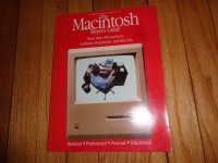 The auction with other pictures is here: http://www.ebay.ca/itm/141929997836 | |
| Posted by: sstaylor on 2016-03-14 17:24:48 Apple started out with a sort of beige color, and later moved to what they called "platinum", which was lighter. You can see the transition with the Plus, some of which are beige and later ones platinum. The color on the cover looks pretty accurate. | |
| Posted by: unity on 2016-03-14 21:26:30 Well Apple moved from beige to snow white to platinum to be exact. But the Mac went from beige to snow white. I have that same guide, its pretty common. Dont judge a Mac by its cover, they are a little dark on there. But lets back up a sec. A thousand things can impact the color of the Mac. Lighting alone has a huge impact. Also they can yellow a bit making them seem a little darker. And in this case, its not an actual product but a magazine cover in gloss printed on hard stock. Here is an example of a Mac I have. All I did was change the color temperature of the photo, something cameras do internally based on surrounding light. So depending on how this Mac was shot, it could look like beige or platinum. By the way, if you really want a mind trip the compact displays are not really white, they are blue. That is why in photographs they appear more blue than anything. Because of teh refresh rate and the way the eye works, they appear white - which in the end was the intent. 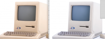 | |
| Posted by: olePigeon on 2016-03-14 21:27:00 128k, 512k, and Apple II through revision A //e should all be Pantone 453. Which Pantone 453, I couldn't say. If I had to guess, 453U for painted plastics (such as the early Apple IIs), and PQ-453U for the machines with colored plastics (early Macintosh, revision B //e.) Some fun history on the color: http://apple2history.org/2012/02/10/pantone-453/ | |
Posted by: Mac128 on 2016-03-25 19:38:25Well Apple moved from beige to snow white to platinum to be exact. But the Mac went from beige to snow white.Need to nip this one in the bud. There is no "Snow White" color. That refers to the name of a design language created by Hartmut Esslinger. The Apple // was beige, but the Apple //c was a color called "fog" which also marked the debut of the Snow White design language. The Mac was only ever Pantone 453 and Platinum. It was never "fog". The Mac switched to the Snow White design language with the SE. Here's some links to other discussions: https://68kmla.org/forums/index.php?/topic/4024-mac-128k-color/#p90321 https://68kmla.org/forums/index.php?/topic/4073-apple-ii-color/ | |
| Posted by: unity on 2016-03-25 19:52:27 Doh! You are right, fog. My bad! (FYI, the SE and II came out on the same day and both use snow white for design) | |
| Posted by: Mac128 on 2016-03-26 10:09:35 No worries ... Have just seen this misnomer perpetrated for far too long. Here's another breakdown that covers the transition. http://68kmac.com/Mac128/Mac_128_Update/Entries/2007/1/2_The_%22Classic%22_Macintosh.html 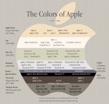 | |
| Posted by: Scott Baret on 2016-03-28 05:40:13 If you know your compact CRT brands and have a particularly sharp eye, you'll notice the blue color of the CRT if you place a Samsung and a Clinton next to each other. The Samsungs are slightly bluer. | |
| 1 |