68kMLA Classic Interface
This is a version of the 68kMLA forums for viewing on your favorite old mac. Visitors on modern platforms may prefer the main site.
| Click here to select a new forum. | |
| Early Finder | |
| Posted by: slomacuser on 2016-01-29 08:38:50 It has been four years since the 128k Mac Twiggy appeard, and now the next big thing after it, for sure the early prototype Finder is. It was written by Bruce Horn and Andy Hertzfeld in the spring of 1982.  Its window was filled with an image of a floppy disc, over which the files were represented as draggable tabs. 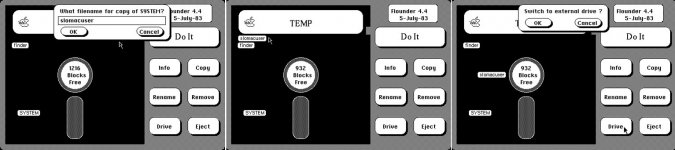 You can select files and perform operations on them by selecting them and then clicking on command button. 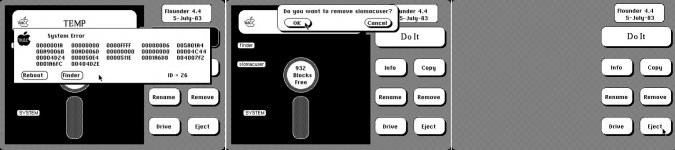 It provides an interesting glimpse of possibilities what they might have chosen instead of what seems so familiar today. The pictures above are showing later version 4.4 of 5-July-1983. And as Bruce said that this version was possibly named by Capps who also helped on programming it when he joined the Mac team. Read more about it on http://www.folklore.org | |
| Posted by: olePigeon on 2016-01-29 11:20:06 Whoa. Good think they changed it. Remind me of Microsoft Bob. | |
| Posted by: CC_333 on 2016-01-29 14:43:14 Yeah, though I think it was meant as a proof of concept mostly? c | |
| Posted by: ScutBoy on 2016-01-29 18:01:48 Well, remember they were pretty much making it up as they went. There were no expert GUI designers at the time 🙂 | |
| Posted by: Paralel on 2016-01-30 11:39:42 Flounder. Love it. | |
Posted by: commodorejohn on 2016-01-30 18:37:59Yeah, though I think it was meant as a proof of concept mostly?That's the impression I get from the folklore.org articles. I doubt they ever seriously considered that for the final product. Though it certainly would've fit in fifteen years later, when pointless, counterintuitive skeumorphism was all the rage... | |
| Posted by: CC_333 on 2016-01-30 21:06:33 Yeah, and now GUI designers seem to be once again striving for a simple, flat, 2D appearance that bears a remarkable resemblance to the Finder in SSW 1 through 7. The GUI has come full circle! Frankly, I never minded the skeumorphism that much, particularly that found in iOS <7 and Mac OS X <Yosemite (I find Mountain Lion and Mavericks to be the most tasteful of the "skeumorphic" OS X-es, followed by Snow Leopard, the last OS X that wasn't "iOS-ified"). c | |
| Posted by: Paralel on 2016-01-30 22:35:09 I liked skeumorphism & Trompe-l'œil in GUI design. This flat stuff sucks. System 7's true flatness looked way better than the crap they are pushing these days as pseudo-flat. I don't know why they are doing this pseudo-flat thing. They got bored trying to make things look nice? IDK. | |
| Posted by: commodorejohn on 2016-01-30 22:48:20 Yeah, there's a huge difference between flat but well-differentiated (as in classic Mac OS) and the stuff they're doing now, which is flat and largely undifferentiated (it's seriously getting harder and harder to tell where or what anything is because they seem to have developed an outright fetishistic aversion to clearly visible borders or meaningful widget shapes,) gratuitously colored but rarely meaningfully color-coded, often just plain hard to read (what the hell is up with all the gossamer-thin, pale fonts that blend right into the background these days?) and generally all-'round just an excellent example of how stupid it is to design UI for fashion chic rather than useful function. This crap wishes it was as good as System 7. | |
| Posted by: Paralel on 2016-01-30 23:36:41 If they embraced true System 7 style design, I wouldn't have a problem with that. But the stuff they are putting out is crap | |
Posted by: CC_333 on 2016-01-31 01:01:59...the stuff they are putting out is crapYou know, I agree! Too much mushy flatness. c | |
| Posted by: techknight on 2016-01-31 07:01:40 Oh god... it was windows 8 before... windows 8. lol.... | |
| Posted by: Paralel on 2016-01-31 11:59:06 Yeah, Windows 8 started the trend. It makes me hate Microsoft all the more. I was really holding out hope that no one else would embrace it and it would die with Windows 8. No such luck... Windows 7 looks so much better. | |
| Posted by: IPalindromeI on 2016-01-31 12:47:52 Really? Compared to the glitzy-glossy skeuomorphism and sheen of Web 2.0/Aqua/Aero, visually it's much more austere, professional, and less in-face-your-face, and UX wise it just gets out of your way. Metro was a revelation visually, when it came out. There's all different implementations of the ideal. Metro is the one that codified it, Google's Material adds depth, and I find Apple's to be just a bit lazy about it, by being a bit half-hearted and focusing on visuals above all. Windows 8 is fine, though the dual-mode concept throws people off. Just ignore the other half, and it's not big deal. 8.1 fixed many of the problems people had, and even then I find it's faster than 7. You want a hot mess? Windows 10 will be there. | |
| Posted by: Elfen on 2016-01-31 16:23:17 Didn't the Lisa and Mac 128K prototypes have 5.25in disk drives?   | |
| Posted by: Paralel on 2016-01-31 18:16:48 They were known as "Twiggy" drives, which really sucked. | |
Posted by: commodorejohn on 2016-01-31 23:11:41Really? Compared to the glitzy-glossy skeuomorphism and sheen of Web 2.0/Aqua/Aero, visually it's much more austere, professional, and less in-face-your-face, and UX wise it just gets out of your way.Aqua/Aero aren't good either, to be sure. But Metro is awful and no mistake. The fetish for making everything out of unadorned bordered rectangles, the random coloring (I particularly hatelove the vivid red X button that remains vivid red no matter what your system color scheme is set to - and great job taking away my ability to actually define the color scheme I want there, Microsoft. Was that anathema to the Cult of Metro and High Priest Sinofsky?) The flat, single-color, quasi-abstract icons. The vast wastelands of empty space in the default layouts. The ridiculous multi-screen Metro thing that's just a very bad, very space-wasting reimplementation of the Start menu. It's a total mess. | |
| 1 |